
From Excel to Power BI: when is it time to make the move?
If monthly reporting starts with collecting files, look at the process first. Here is a practical way to decide what belongs in Power BI and what can stay in Excel.
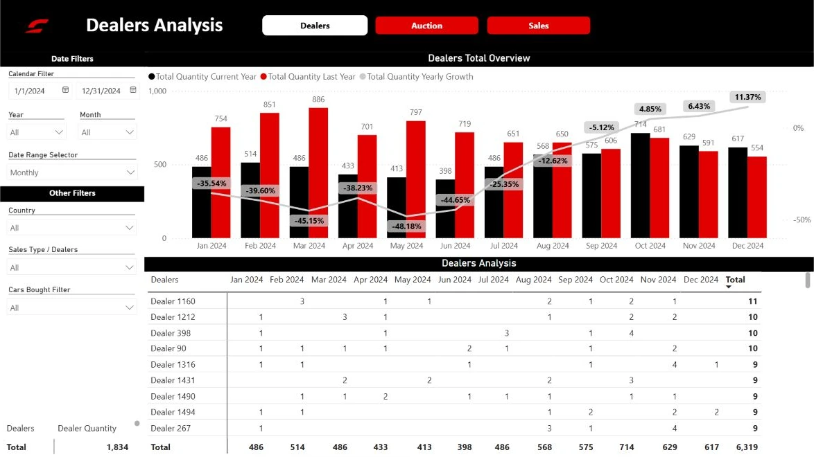
Start with the work you repeat
The reason to move should be the reporting process, not just the appearance of the charts. Think about your last monthly report: how many files did you collect, how often did you copy data by hand, and who checked the final total? Repeated steps are a useful place to start.
Excel remains useful for trying calculations, entering plans and working with a small table. Power BI becomes helpful when several people need consistent views of the same measures. You can use both. A useful first project does not require replacing every workbook in the business.
Choose one question and one team
Pick a specific question for the first project: which branches are behind plan, and which products account for the difference? Write down who will use the report and what they will do after reading it. That makes it easier to decide which data and pages belong in the first version.
Agree on the words as well. “Sales” might mean orders, invoices or paid amounts. Two teams can get different answers if only one subtracts returns. Write these rules down before building the report, including the date used for comparison and how cancelled transactions are treated.
Give the source files a consistent structure
Keep one event per row, such as one sales line. Avoid merged cells, totals inserted between transactions and column names that change each month. Store dates as dates and amounts as numbers. Give customers and products stable identifiers so a name change does not break the connection.
In a reporting model, transactions and descriptive tables such as products, customers and dates are often organized separately. Microsoft’s star schema guidance explains that approach. The purpose is to make filtering and aggregation predictable. A chart cannot repair inconsistent source records on its own.
Validate before you roll it out
Compare the first version with an agreed reference report. Use a completed period and check the total, several individual transactions and exceptions such as returns, cancellations or missing values. Trace discrepancies back to the source rather than adjusting a chart to make it look right.
Let a small group use the report for a normal task. Notice where they need an explanation. Success might mean fewer files assembled by hand or a clearer weekly meeting. Choose a measure that matters to your team before the rollout; the number of pages built is not a useful result by itself.
- One business question
- One agreed reference period
- Written definitions for the measures
- Named owners for the report and its sources