
What belongs on the first page of a sales dashboard?
More charts do not always make a report clearer. Start with a few agreed measures and give the team a way to move from the headline number to the products behind it.
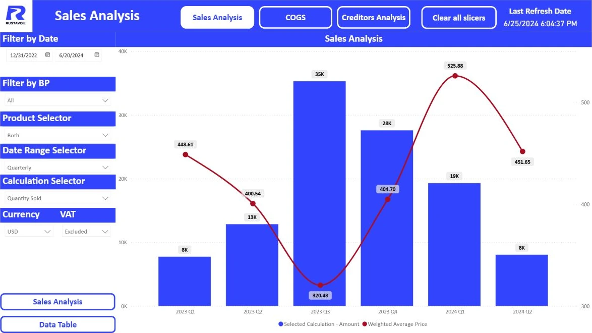
Three questions for the first page
A sales meeting usually starts with three questions: what happened, compared with what, and where does the difference come from? Build the first page around those questions. A few headline measures, a trend over time and a comparison by branch or product are often enough for a useful first version.
Different people need different detail. A manager may want the direction of travel, while a branch lead needs to inspect a particular product. Keep the shared questions on the first page. Give detailed investigation its own space rather than squeezing every table into the overview.
Define each measure before choosing a chart
A starting set might include net sales, units sold, order count and variance against target. Add margin when sales and costs are available on a comparable basis. State whether tax is included, how returns are handled and which currency is used.
Be careful with averages. If one branch has 10 orders and another has 100, taking the simple average of their average order values will not give you the company average. Aggregate the agreed sales amount and order count first, then divide. Decide what the report should show when the denominator is zero, instead of leaving that behavior to surprise the reader.
- Net sales — with returns treated consistently
- Target variance — actual minus target, in amount and percentage
- Average order value — sales divided by the corresponding order count
Compare like with like
Do not compare the first ten days of the current month with a complete previous month as though both periods were finished. Show the selected dates and when the data was refreshed. For a year-on-year comparison, agree whether you mean matching calendar dates or matching working days.
Targets need the right level of detail too. If a monthly target is shown by day, explain the allocation rule. Without that rule, repeating the monthly target on every daily row creates a misleading picture. Measures on the same overview should use consistent filters and clearly labelled comparison periods.
Make the next question easy to answer
When total sales fall, a reader should be able to choose a branch, product or channel and investigate. Use familiar filter names. Make active selections visible and provide an understandable way back to the starting view.
Before launch, ask someone to complete three real tasks: find a branch behind plan, compare two periods and check a specific product. If each step needs an explanation, simplifying the page is usually more useful than adding another chart. Record the confusing labels as well as the technical issues. A single unclear name can make a sound report difficult to use.